Newest Title for the Members Only Article
Connie R • February 24, 2026

This is a Subtitle for your new Article

You can type an introductory paragraph here to introduce some of the main ideas of the article. This template is created using Flex Sections - it is important to use flex sections when creating content on the website, this is because flex sections are formatted in a way that makes designing and layout MUCH easier than the original 'layout' sections of NeonOne and they open up more capabilities, especially when laying out content. Flex boxes are the new standard in web design and in the NeonOne editor it is preferred - most pages should be created using Flex sections.


The only issue is that NeonOne has a slight annoying issue keeping you in Flex Editing mode for posts. Sometimes it will show the circle pointer and say 'double click to exit flex mode' - simple move your cursor back up to the top left of the section where it has a blue bar showing 'Flex Section' and click on it, this should bring it back into the flex editor. This is only an issue in the Blog Posts because NeonOne's back-end template will only allow posts to be in their old 'Layout' Row mode, rather than Flex sections. So I have inserted a flex section into the Row section which is not ideal. Still, these sections have way more functionality.

When in a flex column, select the three dots and select Add Widget to add additional text boxes, like this image caption.

You will likely have to click the lightening bolt to edit each individual flex section because I added multiple sections to show this possible blog format. Maybe slightly annoying but the added functionality outweighs the extra clicking when you're able to create a nice flex layout for your posts.


"You will notice that creating sections and adding content is much easier using flex sections. This is a two-column flex section using a vertical stacked layout. This area of text sits below the first column and in it's own column. I added this as a text widget into the column"


The great thing about Flex sections is that you can also add more columns inside an existing column, and then stack those (eg. vertically) making it easier to create the style you want.


This will allow you to add additional elements such as images and arrange them near text or other things in whatever way you want.


I will stack this inner column in a vertical fashion so I can have more than one column of text, and add an image.

What I did was created an 'inner column' inside the existing column to add this second text widget. Now that I have two text widgets inside a separate inner column, I can stack them vertically instead of horizontally - all within the original vertically stacked column.


All you have to do is select the 'Add' option while the inner column is selected to add an additional widget, like text or an image:


You can then adjust these columns horizontal and vertical alignment separately, like having them align at the top.

Lorem ipsum dolor sit amet, consectetur adipiscing elit, sed do eiusmod tempor incididunt ut labore et dolore magna aliqua. Ut enim ad minim veniam, quis nostrud exercitation ullamco laboris nisi ut aliquip ex ea commodo consequat. Duis aute irure dolor in reprehenderit in voluptate velit esse cillum dolore eu fugiat nulla pariatur. Excepteur sint occaecat cupidatat non proident, sunt in culpa qui officia deserunt mollit anim id est laborum.


At vero eos et accusamus et iusto odio dignissimos ducimus qui blanditiis praesentium voluptatum deleniti atque corrupti quos dolores et quas molestias excepturi sint occaecati cupiditate non provident, similique sunt in culpa qui officia deserunt mollitia animi, id est laborum et dolorum fuga. Et harum quidem rerum facilis est et expedita distinctio. Nam libero tempore, cum soluta nobis est eligendi optio cumque nihil impedit quo minus id quod maxime placeat facere possimus, omnis voluptas assumenda est, omnis dolor repellendus. Temporibus autem quibusdam et aut officiis debitis aut rerum necessitatibus saepe eveniet ut et voluptates repudiandae sint et molestiae non recusandae. Itaque earum rerum hic tenetur a sapiente delectus, ut aut reiciendis voluptatibus maiores alias consequatur aut perferendis doloribus asperiores repellat.

Make sure to check your post in mobile format.

This is another flex section using a vertical two column layout. This is great for articles.


Try to keep the padding above and below additional sections 2% (or less) so that it flows nicely.


NeonOne doesn't make it easy to edit a Flex section inside it's Blog Post format when in mobile - hopefully this changes in the future, but for now the way to do it is to double click lightening bolt to enter Flex Mode, and making sure to HOVER OVER THE FLEX SECTION BLUE TEXT in the top left of the section that you are aiming to edit AND CLICK, this seems to open up the capabilities without glitching. Sometimes it will pull out and show the circle pointer (double click to exit flex mode) but if you go back up and click over the blue Flex Section area it comes back.

Normally, you are editing in a Universal Layout. There may be issues with how your post appears in Mobile format if you are incorporating columns and other elements that stack. Make you to check your post in all the available formats above (tablet, mobile and mobile horizontal) to make sure it looks good.

If it does not look good in a mobile format, when you edit it in that format it will not change the desktop format and will save separately. Make the changes to the mobile format while in that editing mode and when you are done go back to Universal editing (the computer with the crown on top) to continue. Double-check each version before publishing.

Use the plus symbol hovering over a column to add a column to a section, then add a text widget to that column.


Lorem ipsum dolor sit amet, consectetur adipiscing elit, sed do eiusmod tempor incididunt ut labore et dolore magna aliqua. Ut enim ad minim veniam, quis nostrud exercitation ullamco laboris nisi ut aliquip ex ea commodo consequat. Duis aute irure dolor in reprehenderit in voluptate velit esse cillum dolore eu fugiat nulla pariatur. Excepteur sint occaecat cupidatat non proident, sunt in culpa qui officia deserunt mollit anim id est laborum.

Use the plus symbol hovering over a column to add a column to a section, then add a text widget to that column.

At vero eos et accusamus et iusto odio dignissimos ducimus qui blanditiis praesentium voluptatum deleniti atque corrupti quos dolores et quas molestias excepturi sint occaecati cupiditate non provident, similique sunt in culpa qui officia deserunt mollitia animi, id est laborum et dolorum fuga. Et harum quidem rerum facilis est et expedita distinctio. Nam libero tempore, cum soluta nobis est eligendi optio cumque nihil impedit quo minus id quod maxime placeat facere possimus, omnis voluptas assumenda est, omnis dolor repellendus. Temporibus autem quibusdam et aut officiis debitis aut rerum necessitatibus saepe eveniet ut et voluptates repudiandae sint et molestiae non recusandae. Itaque earum rerum hic tenetur a sapiente delectus, ut aut reiciendis voluptatibus maiores alias consequatur aut perferendis doloribus asperiores repellat.

This is paragraph text. Click it or hit the Manage Text button to change the font, color, size, format, and more. To set up site-wide paragraph and title styles, go to Site Theme.


Best to break up the text with images or headers so it isn't a huge wall of text. Continue formatting your blog posts or articles like you would normally do. Keep this template as a starting point and duplicate it when you make a new one so that others can learn how to use Flex Sections.


Book cover Art - Little Beasts: Art, Wonder, and the Natural World
By - Review by Julianne Snider December 31, 2025
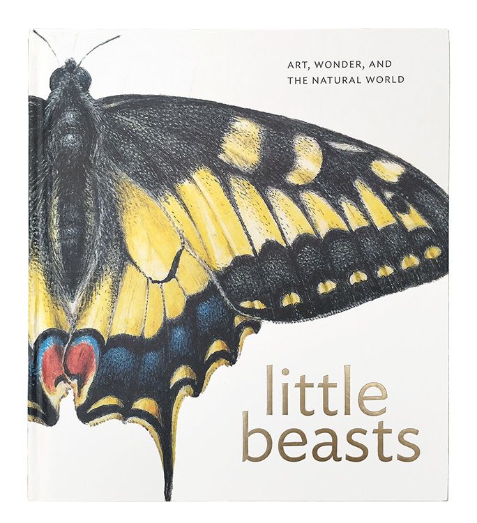
Little Beasts has abundant, detailed images and essays tracing European natural history’s evolution from the 15th–17th centuries. It highlights Flemish artists Joris Hoefnagel and Jan van Kessel’s influential work, showing how art helped document and disseminate knowledge of nature’s diversity during the Renaissance.
Journal of Nature Science Illustrators Vol. 57, No. 2: Front over image
By GNSI December 30, 2025
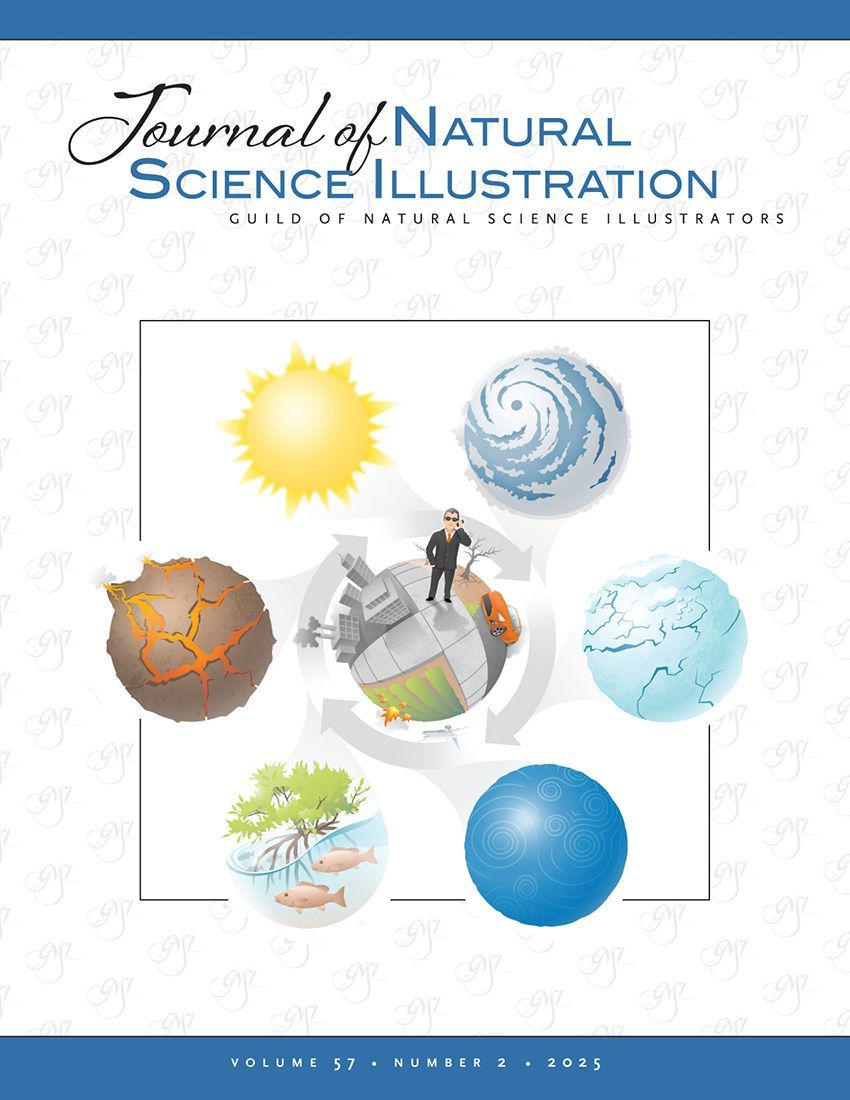
Welcome to the second edition of 2025! This issue highlights the breadth of contemporary natural science illustration—from personal sketchbook practice to anatomy education, climate-science communication, art history, and bioarchaeological reconstruction. Articles explore teaching comparative vertebrate anatomy online, creating effective climate visuals, understanding early natural-history illustration through a review of Little Beasts , and using illustration, genetics, and 3D modeling to reconstruct a medieval skull. Log into your account to view the Journal: JNSI 2025 Vol. 57, No. 2 Not yet a subscriber? To view the issue for free, become a GNSI member today!
Visuals s a Catalyst fro Climate Science Communications
July 15, 2025
Visuals as a Catalyst for Climate Science Communication - Part 1 /July 15, 2025

Share: