Book Review: Building Science Graphics by Jen Christiansen
Building Science Graphics is a new practical guide written and designed by science communicator Jen Christiansen, Senior Graphics Editor at Scientific American, and published by CRC Press.
Building Science Graphics: An Illustrated Guide to Communicating Science with Diagrams and Visualizations by Jen Christiansen
Book review by Diogo Guerra, medical illustrator
Building Science Graphics is a new practical guide written and designed by science communicator Jen Christiansen, Senior Graphics Editor at Scientific American, and published by CRC Press. Contrary to what it may seem, this is not a book about charts or data visualization. As Jen clarifies in the early pages, the term “graphics” refers specifically to “illustrated explanatory diagrams”. (Cover Image) I was thrilled to hear this, since these types of diagrams are among the most frequently used figures in scientific publications but rarely receive the same attention as other types of visuals, such as seemingly more complex, purely figurative scientific illustrations (e.g. anatomical drawings) to more abstract data representations (e.g. data visualizations).

Figure 1: Chapter 3 includes a couple of step-by-step guides on building and adapting science graphics.
The book is extremely well-illustrated, featuring a variety of styles, topics, and showcased artists, demonstrating the book’s relevance to any field or deliverable in science communication. The content is organized into four main chapters:
- Chapter 1, which is the longest one, covers a wide range of introductory technical topics – from design principles and visual style to storytelling strategies; topics that I would argue are as important, if not more so, than pure illustration skills when it comes to creating effective explanatory diagrams.
- Chapters 2 deals with some special considerations for science graphs. I want to give a special shoutout to (a) the discussion about honoring complexity through clarification, rather than simplification, and (b) the several examples that illustrate the importance of and how to visually communicate uncertainty in Science.
- Chapter 3 walks the reader through the creation process, supplemented by several case studies with real-world examples. Additionally, the chapter includes two detailed flowcharts that guide newcomers through each step of the processes of creating/adapting visuals (Fig. 1).
- Chapter 4 features interviews with different professionals about their perspectives on Sciart collaborations. There are a couple of topics in this book that are worth highlighting. The first is perception science and how its insights can help us make more informed decisions on how to create visuals that effectively convey information. While this section is not incredibly detailed, it is still an excellent starting point that can hopefully inspire readers to explore this topic further.
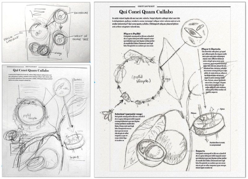
Figure 2: Sketches (left) by Jen Christiansen for “The End of Orange Juice,” by Anne Kuchment, Scientific American (March 2013)
The second theme I want to highlight is knowing the audience of a graphic. Throughout the book, Jen emphasizes the importance of designing visuals that cater to the needs and characteristics of the target audience, such as their level of expertise, age, or cultural background. Unfortunately, the field of Visual Science Communication still lacks sufficient research on how audiences’ preferences and understanding vary with different illustration styles. Nevertheless, I found the emphasis on this topic very pertinent and refreshing, and these factors should definitely be kept in mind and guide decisions about the level of detail, tone, and visual style of the final work. Finally, it’s worth noting that, as Jen acknowledges at the beginning, her perspective is primarily from an American-centric viewpoint. Therefore, the presented style suggestions may not always translate well for international audiences.
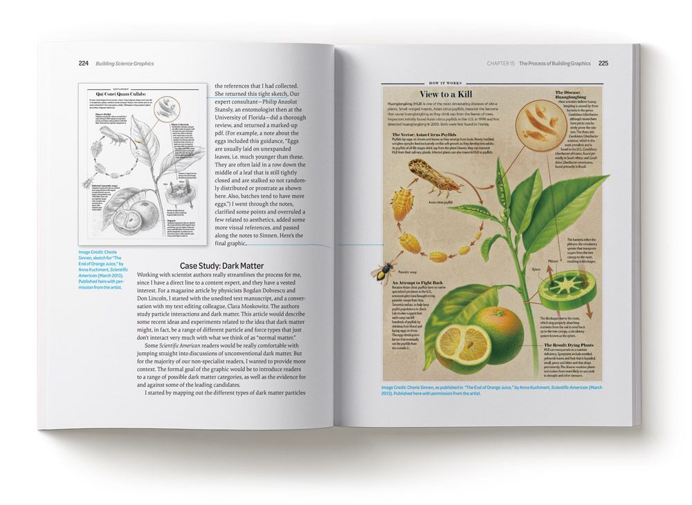
Figure 3: Image Credit: Cherie Sinnen, sketch (left), and as published (right) in “The End of Orange Juice,” by Anne Kuchment, Scientific American (March 2013). Published here with permission from the artist.
This book
feels like an excellent resource for scientific illustration students, scientists who want to improve their visual-creation skills, and science communication enthusiasts. Although the content may be too simplistic for experienced scientific illustrators, the book still contains valuable nuggets of information and recommended further reading that may interest even these seasoned professionals. Therefore, I recommend this book, particularly for those who are new to the field. Alongside some theoretical sections, Jen’s experience shines through her use of real-life case studies and useful practical tips. It would make an excellent introductory textbook for any visual science communication or illustration course/program, and it certainly belongs in the library of any sci-artist.
Diogo Guerra is a Lisbon-based medical illustrator and dataviz designer and consultant, with a background in Veterinary Medicine. Contact hime at:
illustration@diogoguerra.com /www.diogoguerra.com
This open-access article appears in the Journal of Natural Science Illustration, Vol. 55 No. 2, 2023.
Share this post: